
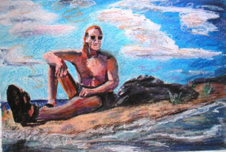
I did the first layer in acrylic, but it was harsh and I didn’t like it. The light was good–lots of contrast–but it looked like paint-by-numbers, and although the composition was pretty good, the sky and bottom of the painting felt empty. I added clouds and moving water. Still boring. So I did a layer over the whole thing with pastels, and then, after some useful criticism from the subject, who is himself an artist, I did a final layer in oil pastel (kind of fancy name for expensive crayons). The result has depth and movement that I really like, and while I used a lot of bright color, the skin tones look perfect from across the room.
Lookin’ Good on Donegal Bay
Reply