It began last fall when I painted a portrait of an old friend I hadn’t seen in years, using an emailed photograph. No one knew I was doing this outrageous thing that I shouldn’t be able to do. It turned out strangely well, considering it was a first and I was just playing. When a friend saw it, she asked me to do a similar portrait of the man in her life. She wanted a painting, not a coulda-been-a-photograph, although she gave me a photo to work from.
I didn’t like the photo at all: I found the values (color intensities) too similar–no good shadows to work with–and the face-front composition truly boring. It lacked tension, motion, shadow, nice shapes. I prefer taking my own photos for paintings, but this was to be a secret gift.
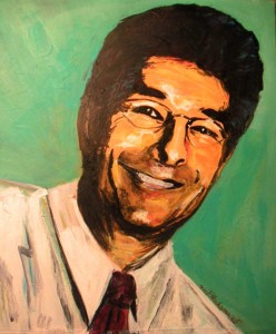
To get rid of too much detail and provide some shadow, I went for exaggeration–extreme contrasts–black and orange with green in the background. An artist friend who knows her stuff thought it too garish and told me how to soften the extreme green and how to mix skin tones. That first effort looked exactly like Jeff Goldbloom (Goldblum?), whom my subject resembles but isn’t him at all.
I used skin tones for my second attempt, and proper, accurate coloring. I softened the green. The values evened out. Yuk. I hated it. I couldn’t stand to look at it. Worse, it looked even less like him than my Jeff Goldbloom version. The only thing that really worked was the composition: I’d tilted the shoulders, which made him look friendly–sexy even–and provided some interesting background shapes. I gave up and left it for a couple months.
Recently, I decided to try again. I went back to my green/black/orange palette, but I added some red and turquoise to jazz it up. This version was also criticized, this time by another artist friend, who fumbled for full minutes as he searched for a diplomatic response. I should have used green for shadows, not black, he said finally. Well, it’s your style, he said. Okay, he’s right. He went to art school, for Pete’s sake. I think both my artist friends were right, that I shouldn’t have used black, although I did mix my own black from alizerin, dark hooker’s green, some ultramarine, and whatever else it took to make it look right. It’s not black out of the tube.
Anyway, I emailed a preview–this picture–to my client-friend so she would not have to deal with a shocked reaction in my presence. We’d agreed that she didn’t like it, she could pay me a cut fee, as we call it in the writing biz. I’m not sure what it’s called in the art world. I have crashed this art party and don’t know all the rules.
She raved, She really likes it. I like it too. The high contrast brings out the strength in his face and celebrates his genuinely wonderful smile. So what if he’s orange? Andy Warhol might have approved. A bonus: the high contrast gray-scales beautifully, a plus for my subject, whose picture appears regularly in the local paper.